Bootstrap WYSIWYG Editor v2

Compatible with Bootstrap 5 and 4!
With RTL and Dark UI support

In eo enim positum est id, quod dicimus esse expetendum.

Lorem ipsum dolor sit amet, consectetur adipiscing elit. Haec para/doca illi, nos admirabilia dicamus. Cur fortior sit, si illud, quod tute concedis, asperum et vix ferendum putabit? Frater et T. Quid ei reliquisti, nisi te, quoquo modo loqueretur, intellegere, quid diceret? Duo Reges: constructio interrete. Ergo hoc quidem apparet, nos ad agendum esse natos. Videsne quam sit magna dissensio?

Qui ita affectus, beatum esse numquam probabis;

Quacumque enim ingredimur, in aliqua historia vestigium ponimus. Commoda autem et incommoda in eo genere sunt, quae praeposita et reiecta diximus; Ille enim occurrentia nescio quae comminiscebatur; Sit hoc ultimum bonorum, quod nunc a me defenditur;

  • Et quidem, inquit, vehementer errat;
  • Qui si omnes veri erunt, ut Epicuri ratio docet, tum denique poterit aliquid cognosci et percipi.
  • Cum salvum esse flentes sui respondissent, rogavit essentne fusi hostes.
  1. Rhetorice igitur, inquam, nos mavis quam dialectice disputare?
  2. Nam illud vehementer repugnat, eundem beatum esse et multis malis oppressum.
  3. Dulce amarum, leve asperum, prope longe, stare movere, quadratum rotundum.

Suam denique cuique naturam esse ad vivendum ducem.

Est enim tanti philosophi tamque nobilis audacter sua decreta defendere. Videsne, ut haec concinant? Bonum incolumis acies: misera caecitas. Dempta enim aeternitate nihilo beatior Iuppiter quam Epicurus; Quorum sine causa fieri nihil putandum est. At enim sequor utilitatem. Ita fit beatae vitae domina fortuna, quam Epicurus ait exiguam intervenire sapienti. Consequatur summas voluptates non modo parvo, sed per me nihilo, si potest;

Theophrastum tamen adhibeamus ad pleraque, dum modo plus in
virtute teneamus, quam ille tenuit, firmitatis et roboris.

Non igitur de improbo, sed de callido improbo quaerimus,
qualis Q.

Age nunc isti doceant, vel tu potius quis enim ista melius?

Egone quaeris, inquit, quid sentiam? Quare ad ea primum, si videtur; Cur iustitia laudatur? Ita relinquet duas, de quibus etiam atque etiam consideret. Sed quot homines, tot sententiae; Frater et T. Tum ille: Ain tandem? Quid sequatur, quid repugnet, vident. Quid est enim aliud esse versutum? Occultum facinus esse potuerit, gaudebit; Restinguet citius, si ardentem acceperit.

Quid ergo aliud intellegetur nisi uti ne quae pars naturae neglegatur? Nulla erit controversia. In qua quid est boni praeter summam voluptatem, et eam sempiternam? Ita prorsus, inquam; Nam de isto magna dissensio est.

Getting Started

Requirements

There are a few requirements you need to meet before you can use Bootstrap WYSIWYG Editor, those are jQuery (version 3.x.x), Bootstrap 5. Bootstrap WYSIWYG Editor can also be used with Bootstrap 4!

In this version, the contenteditable element is inside an iframe. As a result, the editable content will be isolated from the rest of the page.

Installation

Installing Bootstrap WYSIWYG Editor is pretty straight forward. Simply include the jQuery, Bootstrap 5, Bootstrap WYSIWYG Editor and CSS library file, like so:

<link rel="stylesheet" href="https://cdn.jsdelivr.net/npm/bootstrap@5.3.3/dist/css/bootstrap.min.css" type="text/css" media="screen" />
<link rel="stylesheet" href="css/wmwysiwygeditor.css" type="text/css" media="screen" />

<script type="text/javascript" src="https://code.jquery.com/jquery-3.0.0.min.js"></script>
<script type="text/javascript" src="https://cdn.jsdelivr.net/npm/bootstrap@5.3.3/dist/js/bootstrap.bundle.min.js"></script>
<script type="text/javascript" src="js/wmwysiwygeditor.js"></script>

Notice the jQuery library I included was google code library, We recommend using latest version.

It is highly recommended that all JavaScript be placed after all your content at the footer of the page, just before the end </body> tag. This ensures that all content is loaded before manipulation of the DOM occurs.

Usage

Basic

Create your <div> with an ID or Class.

<div id="wmwysiwyg-basic-use"></div>

Now activate the Bootstrap WYSIWYG Editor like this

$('#wmwysiwyg-basic-use').wmwysiwyg();

With options

Another example with some options defined.

$('#wmwysiwyg-with-options').wmwysiwyg({
	class: 'border-primary',
	toolbar_class: 'text-center border-primary bg-primary',
	statusbar_class: 'border-primary bg-primary text-white',
	toolbar_btn_class: 'btn-sm btn-primary',
	height: 300,
	btns: [
		'fullScreen',
		'formatting', 'fontSize',
		'bold', 'italic', 'underline', 
		'foreColor', 'backColor',
		'link', 'insertImage', 'createTable',
		'textAlignment',
		'indent', 'outdent', 
		'ul', 'ol', 'hr',
		'removeFormat',
	]
});

Hey There!

Its another MW WYSIWYG Editor example.

Options

The plugin’s default settings can be globally modified using $.extend and by extending the $.fn.wmwysiwyg.defaults object.

// Change default settings globally
$.extend(true, $.fn.wmwysiwyg.defaults, {
	direction: true,
	statusbar: false,
	lang: 'ar'
});

bootstrap_v

type number
default 5

Set the bootstrap version, 5 or 4.

bootstrap_v: 4 // for Bootstrap 4

btns

type array
default [
["formatting", "fontSize"],
["bold", "italic", "underline", "strikeThrough"],
["foreColor", "backColor"],
["link", "insertImage", "createTable"],
"textAlignment",
["subscript", "superscript"],
["indent", "outdent"],
["ul", "ol", "hr"],
"removeFormat",
["source", "fullScreen"]
]

The editor’s toolbar buttons are defined using a 2-dimensional array. Each sub-array represents a group of buttons that will be displayed together in the toolbar. This allows you to easily organize related buttons into logical groups.

btns: [
	["formatting", "fontSize"],                       // Group 1: Formatting options
	["bold", "italic", "underline", "strikeThrough"], // Group 2: Text styling
	["foreColor", "backColor"],                       // Group 3: Text colors
	["link", "insertImage", "createTable"],           // Group 4: Insert elements
	"textAlignment",                                  // Group 5: Text alignment (single button group)
	["subscript", "superscript"],                     // Group 6: Subscript and superscript
	["indent", "outdent"],                            // Group 7: Indentation
	["ul", "ol", "hr"],                               // Group 8: Lists and horizontal rule
	"removeFormat",                                   // Group 9: Remove formatting (single button)
	["source", "fullScreen"]                          // Group 10: Source code view and fullscreen mode
]

In this structure, groups of buttons are defined as arrays, and individual buttons can be defined as single strings. For example, "textAlignment" and "removeFormat" are single buttons, while groups like ["bold", "italic", "underline"] contain multiple buttons related to text styling.

You can customize the toolbar by adding, removing, or rearranging buttons and groups to fit your needs.
class

type string
default null

A string of css class(s) added to the editor.

class: "my-editor"

toolbar_class

type string
default null

A string of css class(s) added to the toolbar.

toolbar_class: "justify-content-center bg-primary border-primary"

toolbar_btn_class

type string
default null

A string of css class(s) added to the toolbar’s buttons.

toolbar_btn_class: "btn-primary btn-sm"

toolbar_sticky

type boolean | integer | string
default false

This feature allows the editor’s toolbar to remain visible at the top of the screen while scrolling down the page. The option can take three types of values:

  1. Boolean (true or false) : Set to true to make the toolbar sticky without any additional offset.
    toolbar_sticky: true
  2. Integer : You can specify an integer value as the offset (in pixels) from the top of the page. This is useful if you have a fixed header or some space you want to leave above the toolbar.
    toolbar_sticky: 100  // 100px offset from the top
  3. String : Provide a CSS selector string of an element on the page, and the editor will use the height of this element as the offset for the sticky toolbar. This is handy when you want the toolbar to stick below a dynamic element (e.g., a header that changes height).
    toolbar_sticky: '.my-header'  // Uses the height of the .my-header element

statusbar

type boolean
default true

This option let you enable or disable the status bar at the bottom of the editor.

statusbar: false	// disable the status bar

statusbar_class

type string
default null

A string of css class(s) added to the statusbar.

statusbar_class: "border-primary bg-primary text-white"

theme

type string
default null

The theme option allows you to define the UI theme for the editor, such as dark or light.

For Bootstrap 5, it adds the data-bs-theme attribute to the element and the html tag inside the iframe, while for Bootstrap 4, it uses the data-theme attribute. The text color inside the iframe will automatically adjust.

// Set theme to dark
theme: 'dark'

// Set theme to light
theme: 'light'

The CSS for handling the color scheme of the elements (such as toolbar buttons, status bar elements, modal elements, etc.) depends on Bootstrap or your own custom styles. For Bootstrap 5’s color mode support, please refer to their documentation here.

height

type integer
default null

By default the editor’s height will automatically adjust (increase or decrease) as content is added or removed. If you want to set a specific height for the editor, you can provide an integer value representing the height in pixels. However, the value must be greater than 250.

height: 400  // Sets the editor's height to 400px

lang

type string
default en

Set the language to be used in the editor’s interface.

lang: "ar",
direction: 'rtl'

direction

type string
default null

Set the value to ltr for Left-to-Right or rtl for Right-to-Left to define the direction of the editor.

// Set text direction to Right-to-Left
direction: 'rtl'

// Set text direction to Left-to-Right
direction: 'ltr'

The CSS for handling the direction of elements (such as toolbar buttons, status bar elements, modal elements, etc.) depends on Bootstrap or your own custom styles. For Bootstrap 5’s rtl support, please refer to their documentation here.

spellcheck

type boolean
default true

Set the value to false to disable spellcheck to stop highlighting spelling mistakes.

spellcheck: false

textarea

type string
default null

This option creates a hidden <textarea> element for form submissions. The value of this option should be a string, which will be used as the name attribute of the textarea. This is useful for capturing the editor’s content and submitting it with a form.

textarea: 'editorContent'

stylesheets

type array
default [ ]

The stylesheets option accepts an array of CSS stylesheet links. These stylesheets will be loaded into the <head> of the iframe to apply styles to the content.

stylesheets: [
	'https://cdn.jsdelivr.net/npm/bootstrap@5.3.3/dist/css/bootstrap.min.css',
	'css/my-styles.css'
]

append_in_head

type string
default null

The append_in_head option allows you to append custom CSS directly inside the <head> tag of the iframe. This is useful for adding specific styles that should apply only to the content within the editor.

append_in_head: '<style>>body { font-family: Arial; }</style>'

Methods

You can use any of the following ways to interact with the editor:

  1. jQuery-style Method Call : You can call public methods directly using the jQuery-style syntax.
    $('#editor').wmwysiwyg();
    var returned_data = $('#editor').wmwysiwyg('publicMethod', argument1, argument2 ... argumentN);
    
    // Get the html contents
    var contents = $('#editor').wmwysiwyg('getContents');
    
    // Set new content in the editor
    $('#editor').wmwysiwyg('setContents', "<h1>Hello There!</h1>");
  2. Using an Instance : You can create an instance of the editor and call public methods directly on it.
    // Create an instance of the editor
    var editor = $('#editor').wmwysiwyg();
    var returned_data = editor.publicMethod(argument1, argument2 ... argumentN);
    
    // Get the html contents
    var contents = editor.getContents();
    
    // Set new content in the editor
    editor.setContents("<h1>Hello There!</h1>");

getContents

This method returns the current HTML content of the editor.

getContentsAsText

This method returns the current content of the editor as text.

setContents

Parameter(s)

  1. contents: string

The method allows you to set or replace the current contents of the editor.

execCom

Parameter(s)

  1. command: string
  2. default_ui: boolean
  3. value: string

The execCom method behaves like the standard execCommand, but it operates within the editor’s iframe. This allows you to apply formatting commands directly to the content inside the iframe, such as making text bold, creating links, or inserting images.

// Make selected text bold within the editor iframe
var editor = $('#editor').wmwysiwyg();
editor.execCom('bold');

// OR
$('#editor').wmwysiwyg('execCom', 'bold');

insertHTML

  1. html: string | object

This method works like execCommand('insertHTML'), inserting HTML content at the current cursor position within the editor. However, unlike execCommand, it can accept either an HTML string or an HTML object.

// Insert HTML string
$('#editor').wmwysiwyg('insertHTML', "<strong>Hello World!</strong>");

// Insert HTML object
let newElement = document.createElement('div');
newElement.innerHTML = "<p>This is a new paragraph.</p>";
$('#editor').wmwysiwyg('insertHTML', newElement);

setTheme

Parameter(s)

  1. theme: string

Allows you to switch between available themes (such as light or dark).

destroy

This method destroys the editor instance and leaves the last edited HTML content within the element.

Callbacks

This plugin supports a few callbacks. In all the callbacks, the this context refers to the editor instance, giving you direct access to its methods and properties.

beforeInit

This callback is executed before the editor is initialized.

$('#editor').wmwysiwyg({
	beforeInit: function () {
		console.log('Before initialization:', this);
	}
});

afterInit

This callback is executed after the editor has been fully initialized.

$('#editor').wmwysiwyg({
	afterInit: function () {
		console.log('After initialization:', this);
	}
});

onChange

This callback is triggered whenever the content of the editor changes.

$('#editor').wmwysiwyg({
	onChange: function (content) {
		console.log('Content changed:', this, content);
	}
});

More Products

DnD Zone

A tiny vanilla javascript library to create drop zone for input file element and its FREE to use.

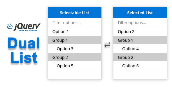
jQuery Dual List

Its a drop-in stylish replacement for the standard <select> with multiple attribute activated.

jQuery Carousel

A lightweight and responsive Carousel.